SWISS AMERICAN
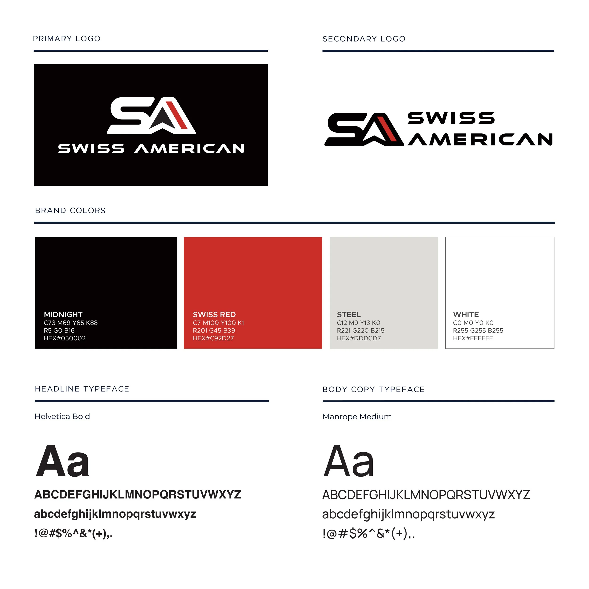
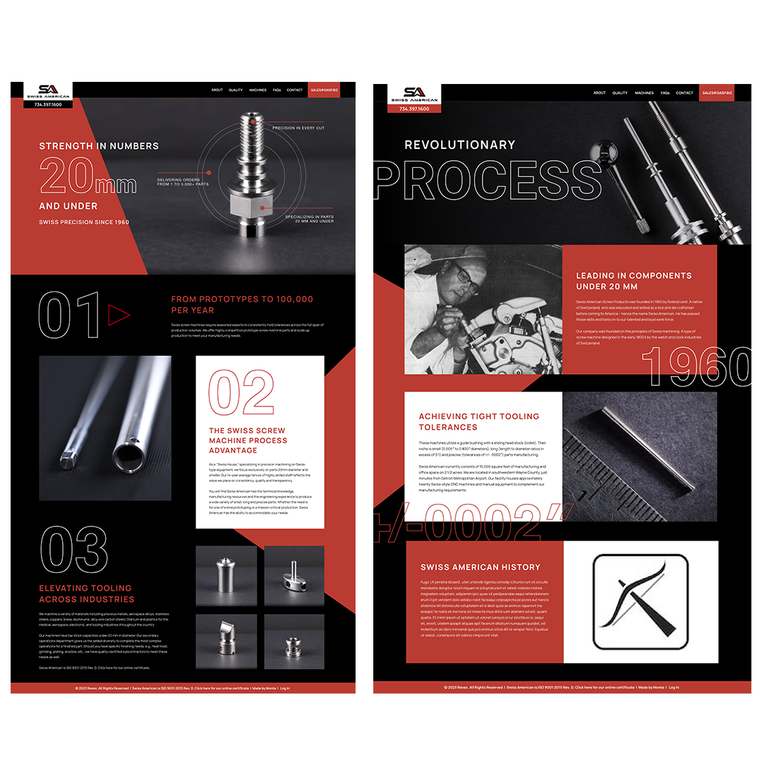
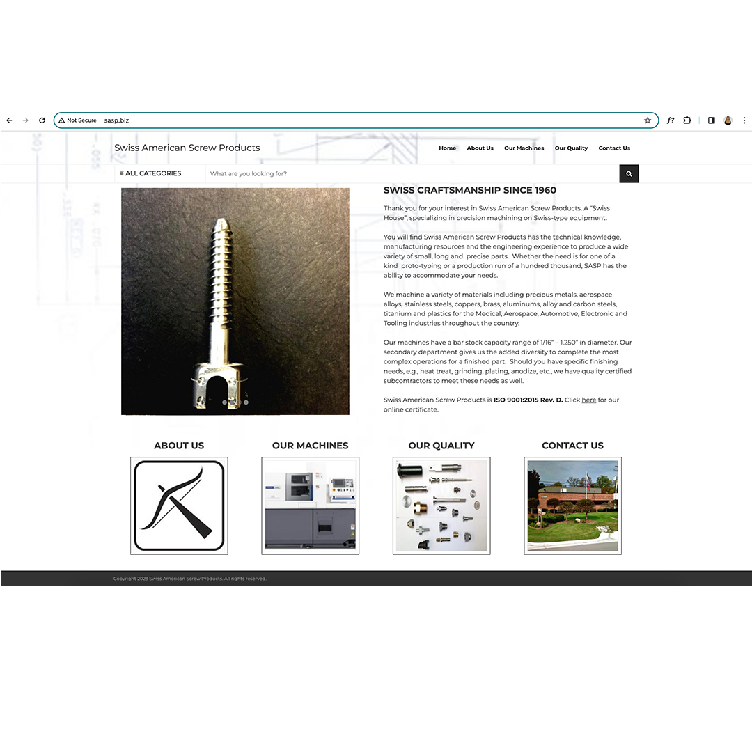
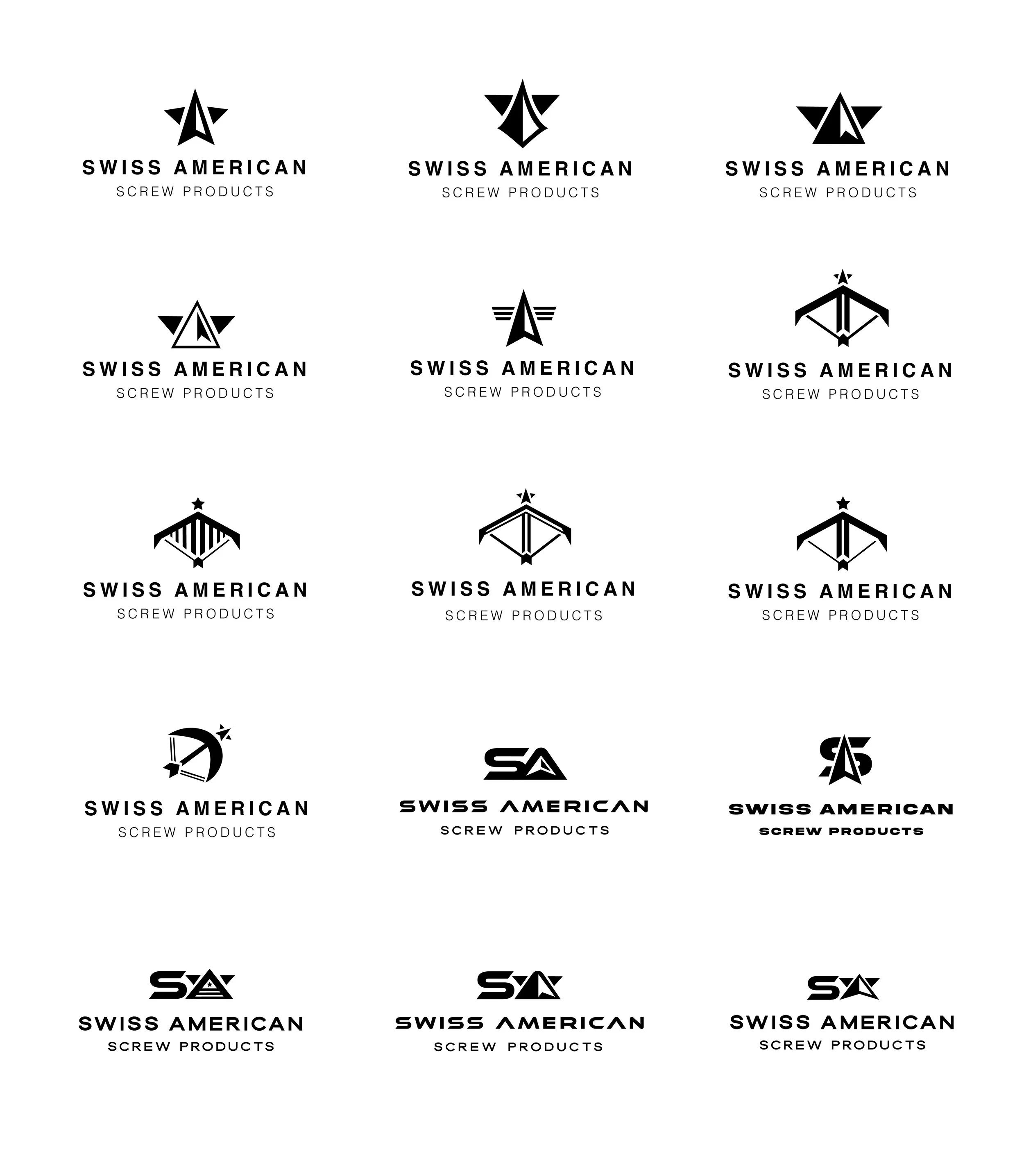
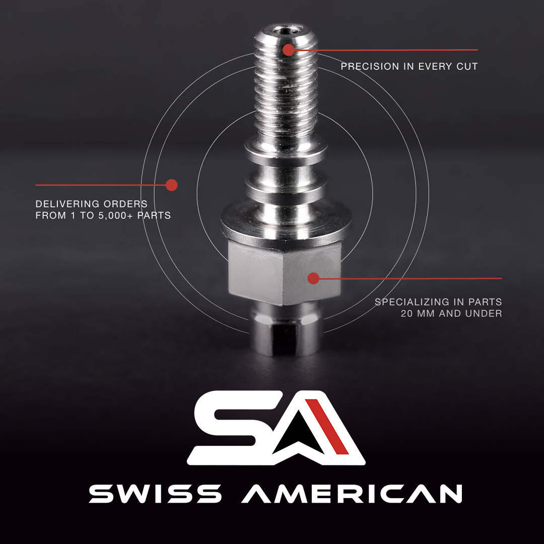
Swiss American was looking for a rebrand of their logo and website to convey their machinery’s precision and engineering prowess. As many of their screw parts are used in the aerospace field, I wanted to craft a logo that incorporated flight, precision, Swiss design, and American manufacturing. The “A” in the logo has a wing arrow shape in the counter as well as alternating white and red stripes to represent the USA. The machine parts at Swiss American can produce very straight lines as well as precise organic curves so I wanted the logo to have the sharp precision in angles, but soft rounded corners. In addition, I also designed a custom, dynamic and responsive website in XD that showcases the company’s products with engineering visual elements such as bold color schemes with high contrast, modern typography, and stylized imagery that interacts with the type. The previous site design can be seen in the third slide. The new site can be viewed at https://sasp.biz/

